I. Introduction
In the ever-evolving landscape of web and mobile app development, UI design stands at the crossroads of innovation and art. It architects the user experience, painting the visual identity of an application. And what better place than Paris, the city of art and creativity, to draw inspiration and innovation in UI design?
In this comprehensive guide, we invite you to dive into the captivating universe of UI design in Paris. We'll explore the fundamentals driving this discipline, current trends propelling it to new heights, best practices making it a true art form, the creation process structuring it, and finally, we'll dissect compelling case studies illustrating its real impact.
Préparez-vous à une immersion totale dans les secrets d’un UI design exceptionnel, baigné de l’atmosphère unique de la Ville Lumière.
II. Fundamentals of UI Design in Paris
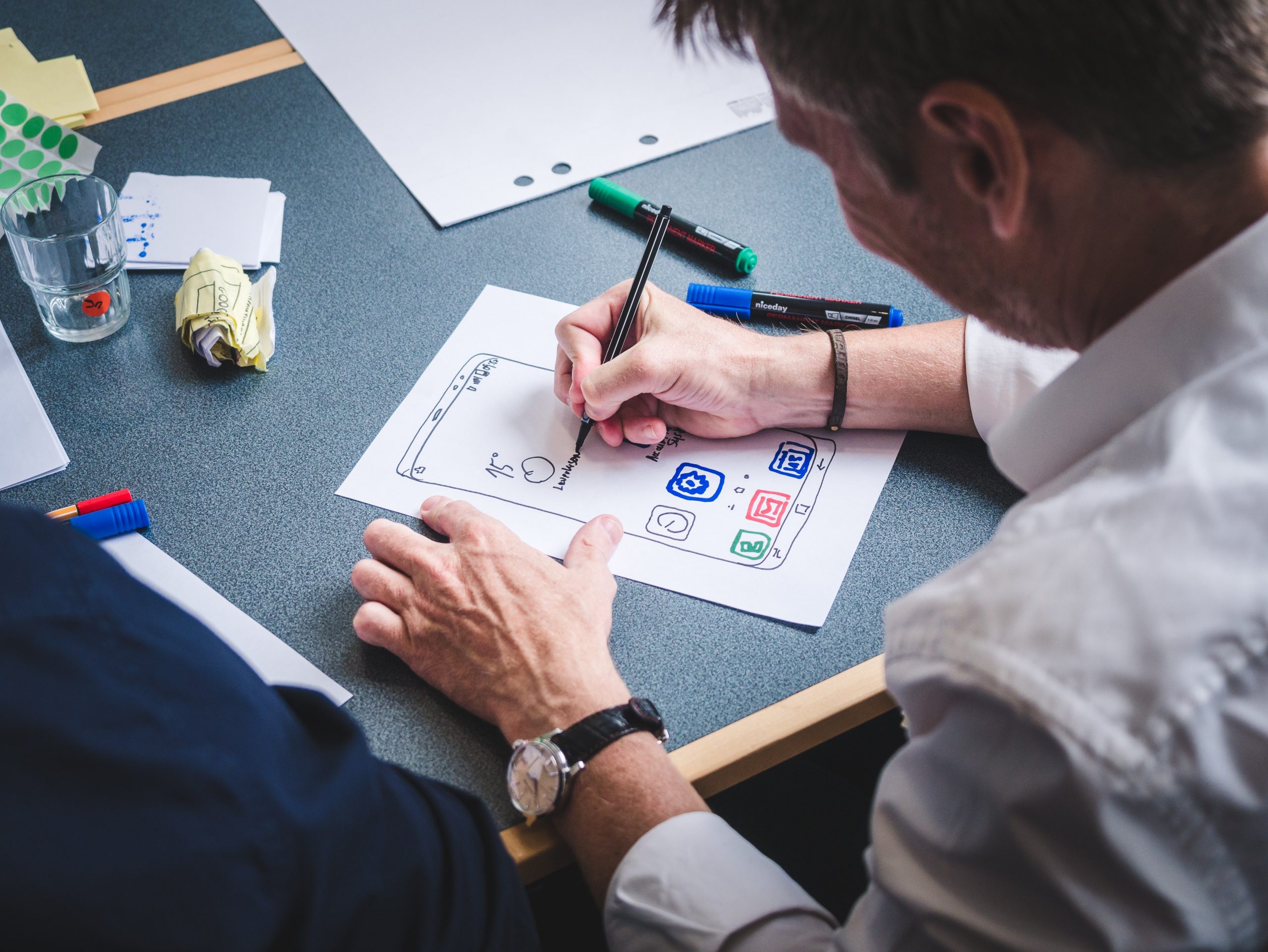
Creating exceptional user interfaces is a complex art, requiring mastery of the fundamentals. This first section looks at the pillars of UI design in Paris, highlighting the crucial importance of harmonizing visual elements with corporate identity, while capturing the quintessence of the City of Lights.
Layout: The Art of Guiding the Eye
Layout is the basis of any interface design. In Paris, where every street is a work of art, the layout must be meticulously thought out. Here are some practical tips:
- Create a clear structure: Organize your elements logically for smooth navigation.
- Use the grid: The grid allows for a balanced distribution of elements, reinforcing visual order.
- White as space: Don't be afraid of empty space. In Paris, simplicity is often synonymous with elegance.
Typography: Elegance in Words
The choice of fonts is a key element of visual identity. In Paris, typography must reflect refinement. Here are some practical tips:
- Select readable fonts: Prioritize readability, but add a touch of sophistication.
- Be consistent: Stick to a few fonts for a unified look.
- Experiment: Paris is a city of creativity. Don’t hesitate to explore new typographies, but sparingly.
Color Choices: Emotion in Tints
The color palette influences emotions and associations. In Paris, color choices are of great importance. Here are some high-quality recommendations:
- Look for inspiration in Parisian art: The museums and streets of Paris are full of inspiring palettes.
- Stay true to the brand: Colors should reflect the company's identity while adapting to the Parisian atmosphere.
- Test accessibility: Make sure the colors chosen do not compromise accessibility for all users.
The Visual Hierarchy: Guide and Seduce
The visual hierarchy guides users by highlighting essential elements. In Paris, where attention to detail is sacred, a well-designed visual hierarchy is essential. Here are some practical tips:
- Use size and color: More important elements should be larger and more visible.
- Play with typography: Use different fonts to distinguish levels of content.
- Do usability testing: Revise your visual hierarchy based on user feedback.
III. Current Trends in UI Design in Paris
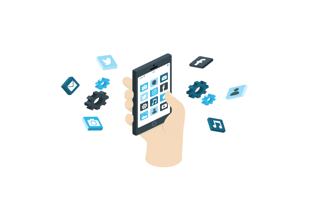
Paris, a true hub of creativity, is where many emerging UI design trends are born. In this section, we delve into the most popular trends such as minimalism, micro-interactions, and overlay effects.
We go beyond observation, providing practical tips to elegantly integrate these trends while maintaining focus on the primary goal of your application.
Minimalism: The Art of Simplification
Minimalism is a major trend in Paris, where the adage “less is more” is often synonymous with sophistication. Here are practical tips for adopting it wisely:
- Clean up the interface: Clean up by eliminating any superfluous elements that don't contribute to the user experience.
- Opt for clarity: Elements should be arranged intuitively, with smooth navigation.
- Use typography wisely: Clean, readable fonts reinforce minimalism while maintaining elegance.
Micro-Interactions: Elegance in the Details
Micro-interactions are the secret touch of design masters in Paris. Here's how to incorporate them harmoniously:
- Prioritize functionality: Every micro-interaction should have a purpose, improving the user experience.
- Bring subtlety: Movements and reactions should be soft and natural, creating a feeling of reality.
- Avoid overload: Micro-interactions should be unobtrusive so as not to distract the user.
Overlay Effects: Depth and Dimension
Overlay effects bring a fascinating dimension to Parisian UI design. Here's how to use them wisely:
- Create depth: Play with shadows and layers to make elements appear stacked on top of each other.
- Stay consistent: Overlay effects should harmonize with the overall style of the interface.
- Be sparing: Too many effects can overwhelm the user. Choose wisely.
IV.Best Practices for Exceptional UI Design in Paris
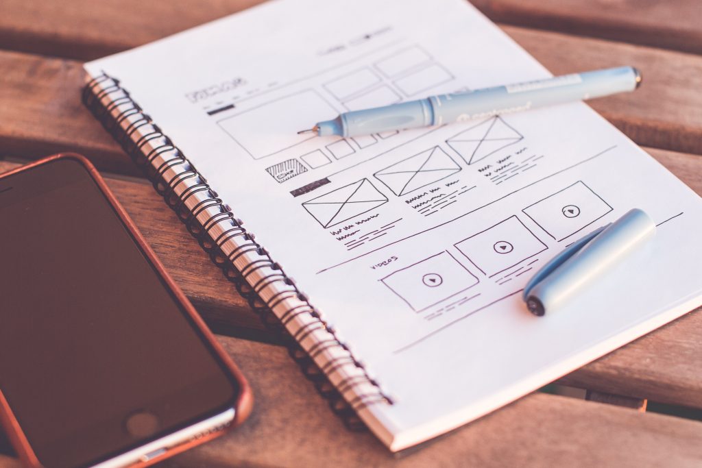
Creating an exceptional user interface relies on essential practices. In Paris, where elegance and sophistication reign, these practices are at the heart of UI design success. In this section, we delve into the fundamentals of UI design in Paris, emphasizing simplicity, consistency, intuitive navigation, and user-friendliness. Concrete tips are provided to improve text readability, ensuring a pleasant user experience, especially on mobile screens. Concrete examples of Parisian brands successfully implementing these practices are also included.
Simplicity: The Art of Clarity
Simplicity is the fundamental pillar of UI design in Paris. Here are some practical tips for integrating this philosophy into your work:
- Éliminez les éléments superflus : Chaque élément de votre interface doit avoir une raison d’être. Supprimez tout ce qui n’ajoute pas de valeur à l’user experience.
- Prioritize clarity: The organization of elements should be intuitive, with smooth navigation. Use clear labels and understandable icons.
- Clean up the typography: Opt for readable fonts and maintain a clear text hierarchy to make it easier to read.
Consistency: The Key to Recognition
Visual consistency reinforces the credibility of your interface. Here's how to maintain visual harmony:
- Establish design templates: Create reusable design templates to ensure consistency across the entire application.
- Follow company standards: Use colors, fonts and visual elements consistent with the brand identity to build recognition.
- Conduct usability testing: Ensure that all parts of the interface work harmoniously to provide a flawless user experience.
Intuitive Navigation: The Art of Guiding the User
Intuitive navigation is the key to a successful user experience. Here are tips for creating a smooth browsing experience:
- Prioritize information: Organize content logically, with clear menus and links for easy access to information.
- Use self-explanatory icons: Icons should be easily understandable without additional text.
- Pay attention to user feedback: Collect feedback to improve the navigation based on the needs of your audience.
Conviviality: The Element of Satisfaction
Usability is the foundation of any successful UI design. Here's how to ensure a friendly user interface:
- Be user-friendly: Listen to user feedback to make continuous improvements to the interface.
- Test on different devices: Make sure the interface is responsive and functional across all platforms and screen sizes.
- Be responsive: Respond quickly to issues reported by users to increase user satisfaction.
V. The Creation Process of UI Design in Paris: The Alchemy of Art and Technology
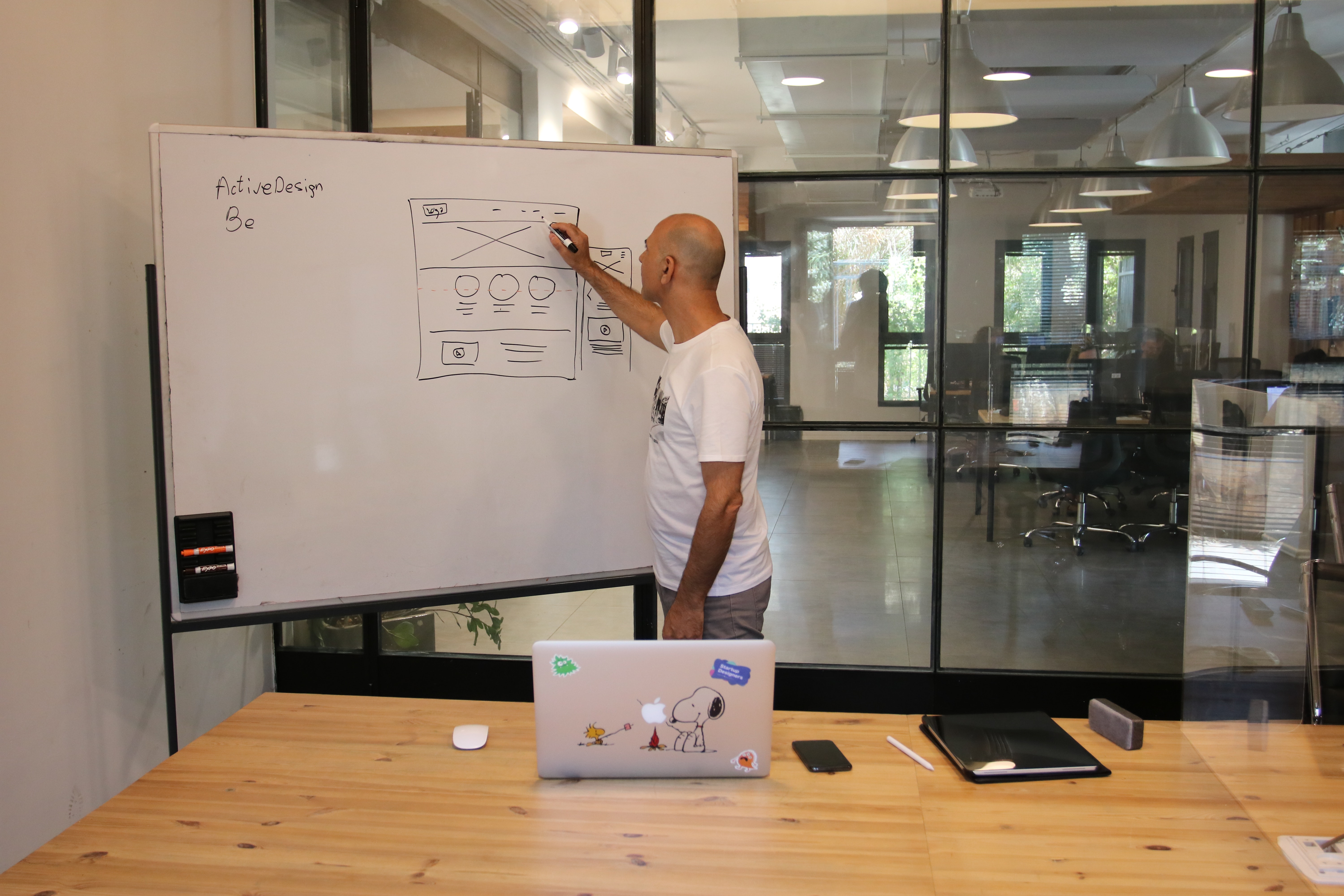
The creation of UI design in Paris is a fascinating journey that follows a rigorous and creative process. In this section, we guide you through the key stages of the process, from initial research to the final design, including wireframing, prototyping, and testing. We highlight the crucial importance of close collaboration between Parisian designers and developers, a necessary synergy to marry creative vision with technical feasibility. We also reveal how iterative feedback stages are key to achieving an optimal final design.
Research: The Art of Understanding the User
La première étape du processus de création de l’UI design à Paris est la recherche approfondie. Voici comment cela se déroule :
- Analyze the target audience: Understand the needs, preferences and behaviors of potential users.
- Study the competition: Analyze similar apps in the market to identify opportunities and gaps.
- Take inspiration from Paris: Drawing on the city's unique atmosphere, find elements that could be incorporated into the design.
Wireframing: The Structure of Design
Wireframing is the step where the structure of the interface takes shape. Here's how to do it:
- Create a visual structure: Sketch the main layouts of the interface elements.
- Plan navigation: Design how users will access different features.
- Keep it simple: Make sure the structure is intuitive and clean for easy navigation.
Prototyping: Setting it in motion
Prototyping brings design to life. Here's how it works:
- Create an interactive prototype: Transform the wireframes into a functional mock-up of the interface.
- Test interaction: Evaluate how users interact with the prototype and identify areas for improvement.
- Refine the design: Use testing feedback to make changes to the design.
Tests: Final Validation
Testing is essential to ensure interface quality. Here's how to carry them out:
- Perform usability testing: Evaluate the interface with real users to identify potential issues.
- Analyze performance: Make sure the interface works optimally on all device types.
- Optimize for responsiveness: Respond quickly to test feedback to improve user experience.
Close Collaboration: The Creative Alliance
The close collaboration between Parisian designers and developers is the cement of the process. Here's how it works:
- Communicate regularly: Continuous communication between creative and technical teams ensures that the artistic vision is achievable.
- Be open to ideas: Innovative ideas can emerge from all team members, regardless of their specialty.
- Work hand in hand: Cooperation is the key to overcoming technical challenges while maintaining design integrity.
Iterative Feedback: The Key to Perfection
Iterative feedback steps are essential to achieve an optimal final design. Here's how to manage them:
- Listen to feedback: Be open to comments and suggestions from users and the team.
- Edit and improve: Use feedback to make adjustments to the design and functionality of the interface.
- Repeat the process: Iterative feedback is a continuous cycle that ensures the interface evolves based on needs and feedback.
VI. Case Studies of Successful Parisian UI Design Projects: Art in Action
Case Study 1: “ChicCloth” – The Elegance of Parisian Fashion
Challenges: The ChicCloth app had to offer an immersive online shopping experience while reflecting the elegance of Parisian fashion.
Solutions: The design team created a clean interface with high-resolution images, elegant icons and intuitive navigation. Additionally, a personalized recommendation system has been implemented to improve user-friendliness.
Results: Conversion rates increased by 30%, and the app received rave reviews for its aesthetics and usability. Online sales saw an increase of 40 1TP3Q.
Practical advice : Adding personalized recommendation features can help users discover new products, thereby increasing sales.
Case Study 2: “ExploreParisNow” – The Adventure of Discovery
Challenges: The ExploreParisNow application had to help tourists discover Paris while integrating real-time navigation functionalities.
Solutions: The team integrated an interactive map with attraction information, recommended routes, and live notifications for public transportation.
Results: The app has been downloaded more than 500,000 times in six months, with an average rating of 4.8 stars. Users praised its usefulness for exploring the city. The average time spent on the app increased by 25 %.
Practical Tip: Incorporating real-time information, such as transportation schedules, can significantly improve the usefulness of a travel app.
Case Study 3: “Artisanal Cuisine” – The Flavors of Paris at Your Reach
Challenges: The CuisineArtisanale application had to offer authentic cooking recipes from Paris, while allowing users to purchase ingredients online.
Solutions: The team designed a user-friendly interface with step-by-step recipes, streaming cooking videos, and e-commerce integration for ingredient purchases.
Results: The app experienced a 50 % increase in user retention rate and generated significant revenue from ingredient sales. Users have shared over 2,000 unique recipes on social media.
Practical Tip: Streaming cooking videos can help users follow recipes interactively, improving the user experience.
Results analysis
These case studies illustrate how Parisian UI design can have a significant impact on user experience and business performance. By analyzing quantitative and qualitative data, we can learn important lessons:
- Parisian aesthetics combined with exceptional usability can increase user satisfaction.
- A well-designed interface can increase conversion rates and user retention.
- Integrating innovative features can meet specific audience needs and generate additional revenue.
Practical Tip: Use analysis tools to monitor the performance of your interface and adjust it based on the data obtained.
VII. The Essential Tools for UI Design in Paris: Create with Excellence
\
The toolbox of a Parisian designer must be carefully curated to craft high-quality user interfaces. In this section, we will delve deeply into the indispensable tools and software that are essential companions for any UI design creator in Paris. Additionally, we'll share specific tips for infusing a local touch into your designs. Get ready to discover how to bring your ideas to life exceptionally.
Adobe XD is prototyping software that simplifies the creation of interactive interfaces. With its user experience design features, you can quickly implement your concepts. To add a Parisian touch, explore Paris-specific design kits available online. These kits include ready-to-use interface elements with a Parisian aesthetic.
Sketch is a vector design application that appeals to many Parisian designers. Its ease of use and flexibility make it a popular choice for creating interfaces. For authentic Parisian design, explore symbol libraries featuring icons and graphic elements inspired by Parisian culture.
Figma is an online collaborative design platform ideal for geographically dispersed teams. When working on UI design projects in Paris, collaboration is essential. Use Figma to share and work on your models in real time with colleagues and clients, anywhere in the world.
Zeplin is an essential tool to ease the transition from design to development. It automatically generates style specs, assets, and CSS code from your mockups, speeding up the development process. Be sure to maintain consistency between design and development, a practice particularly dear to Parisian designers.
VIII. Conclusion
In summary, UI design in Paris is a world of innovation, creativity and refinement. We encourage you to apply the knowledge gained in this guide to improve your own projects. Remember that UI design is constantly evolving, so stay on top of trends and innovations to stay competitive in the market. Paris is your endless source of inspiration for creating exceptional user experiences.


